If you are a beginner to website design or a professional web designer or manager looking for statistics on the most common screen sizes used for responsive website design, this article is for you.
This article provides an overview of browser statistics and also best practices for designing websites for mobile and desktop screens. It is intended for beginners, web designers, and developers who want to create responsive, user-friendly websites that perform well across different devices and screen resolutions.
By understanding the most common screen resolutions, and how to optimize layouts for different screen sizes, you can ensure that your website is accessible, mobile-friendly, and visually appealing to your target audience.
The author has over 20 years of experience in SEO and website development. All sources are cited.
What is the best screen size to design for?
There’s no one best screen size to design for. Websites should transform responsively and fast at all screen resolutions on different browsers and platforms. Accessible. Mobile-friendly. Design for your audience, first. Design from 360×640 through 1920×1080.
Also:
- Design for desktop displays from 1280×720 through 1920×1080
- Design for mobile displays from 360×640 through 414×896
- Design for tablet displays from 601×962 through 1280×800
- Check Google Analytics and optimise for your target audience’s most common resolution sizes
- Do not design for one monitor size or screen resolution. Screen sizes and browser window states vary among visitors.
- Design should be responsive and fast. Use a liquid or responsive layout that transforms to the current user’s window size.
- Monitor Google Search Console mobile-friendly and usability alerts
Your website should look good and work well on all screen sizes. The accepted best practice is to have a responsive website template. Google recommends this explicitly in its guidelines and if you do not follow these guidelines, your website will not rank optimally in Google Search.
If you are interested in SEO, you can access the free SEO checklist in Google Sheets.
Some key things to keep in mind when approaching responsive design are: using flexible grid-based layouts, using CSS media queries, being mindful of different aspect ratios and screen resolutions, and testing the website on a variety of devices.
The three main criteria for optimising a page layout for a certain screen size are:
- Web Page Initial visibility: Is all key information visible above the fold so users can see it without scrolling? This is a tradeoff between how many items are shown vs. how much detail is displayed for each item.
- Web Page Readability: How easy is it to read the text in various columns, given their allocated width?
- Web Page Aesthetics: How good does your page look when the elements are at the proper size and location for this screen size? Do all the elements line up correctly — that is, are captions immediately next to the photos, etc.?
Usability guidelines also recommended you consider all three criteria at the full range of sizes. Check the browser window sizes from 360×640 to 1920×1080 screen resolutions.
Your page should score high on all criteria throughout the entire resolution range.
Your page should also work at even smaller and bigger sizes, though such extremes are less important.
Although such users should certainly be able to access your site, giving them a less-than-great design is sometimes an acceptable compromise.
See this article on the browsers should you test your website on.
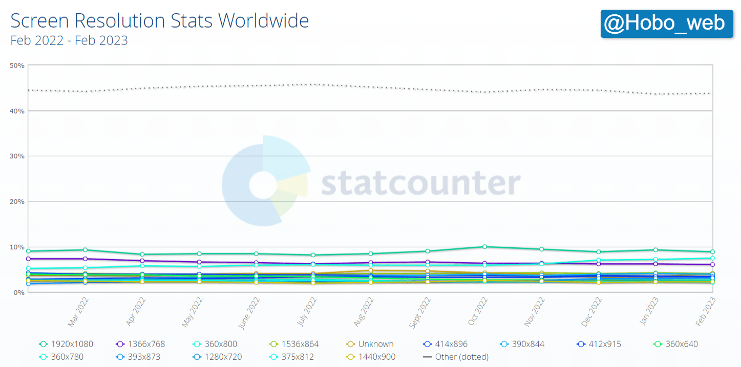
Top 10 most common screen resolutions
What are the top ten most common screen resolutions in use? According to the data an estimate would be:
| 1 | 1920×1080 | 8.83% |
| 2 | 360×800 | 7.43% |
| 3 | 1366×768 | 6.09% |
| 4 | 1280×720 | 6.07% |
| 5 | 1536×864 | 4.02% |
| 6 | 390×844 | 3.89% |
| 7 | 412×915 | 3.41% |
| 8 | 393×873 | 3.03% |
| 9 | 360×780 | 2.72% |
| 10 | 360×640 | 2.53% |
Use a responsive website template
QUOTE: “Google recommends Responsive Web Design because it’s the easiest design pattern to implement and maintain” Google Developer Guides, 2021
A lot of people are using handheld devices (tablets and smartphones) to browse the web and responsive website design (RWD) has emerged as a very likely solution (it is still debated by aficionados) to screen size challenges.
This method moves away from using fixed-width websites and instead uses Media Queries in CSS style sheets to create a website that responds in size to the different viewports of handheld devices and smaller screens that people use.
So whatever device a person may be using to view your website you are able to give them the fullest experience possible.
Google prefers mobile-friendly sites
Google dictates the ebb and flow of online commerce and they’ve just dictated you need to design for a satisfying user experience across multiple devices IF you want to expect to rank high for competitive keywords in Google.
QUOTE: “Google uses two different crawlers for crawling websites: a mobile crawler and a desktop crawler. Each crawler type simulates a user visiting your page with a device of that type. Google uses one crawler type (mobile or desktop) as the primary crawler for your site. All pages on your site that are crawled by Google are crawled using the primary crawler. The primary crawler for all new websites is the mobile crawler. In addition, Google recrawls a few pages on your site with the other crawler type (mobile or desktop). This is called the secondary crawl, and is done to see how well your site works with the other device type.” Google Webmaster Guidelines, 2020
Since April 21, 2015, globally, how mobile-friendly a site has affected ranking performance for websites across a variety of devices.
If you make websites for small businesses – you’ll know they want a website that will perform well in Google organic listings – you know they are interested in search engine optimisation:
SEO is now based, in part, on good website UX, as Google quantifies it, at least for mobile users.
QUOTE: “With mobile searches now exceeding desktop searches, it’s important that your site be mobile-friendly. Googlebot now uses a mobile crawler as the default crawler for websites.” Google Webmaster Guidelines, 2020
At the moment – that essentially now means responsive website design and mobile-friendly, especially with Google their index “mobile-first”.
Mobile-friendliness is one of Google page experience signals.
You can use this free mobile SEO checklist in google sheets to review your own website.
Mobile screen resolution stats worldwide Feb 2022 – Feb 2023
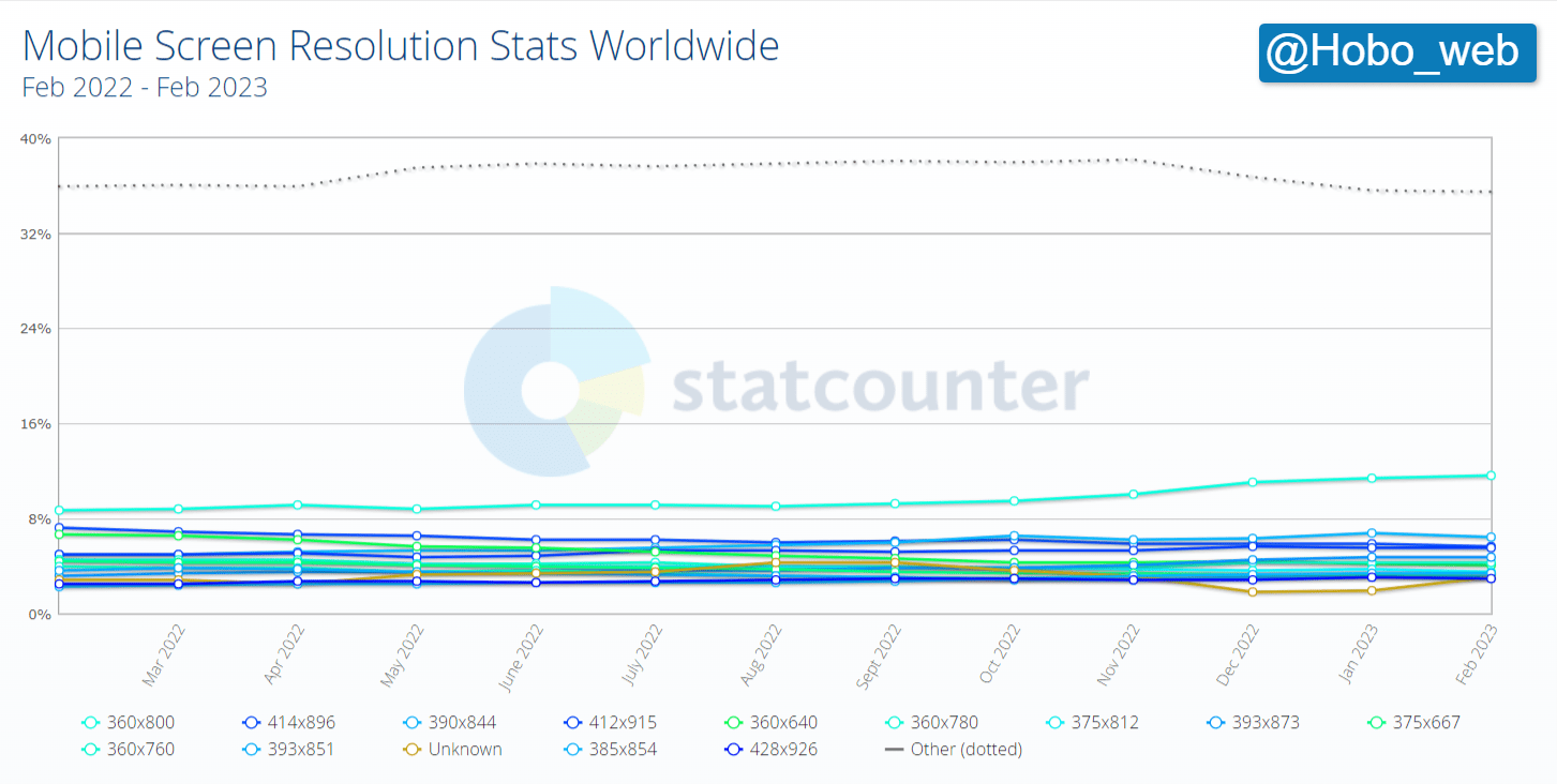
Most Common Mobile Screen Resolution Sizes Worldwide
- 360×800 – 11.62%
- 390×844 – 6.41%
- 414×896 – 5.65%
- 412×915 – 5.47%
- 393×873 – 4.77%
- 360×780 – 4.26%
- 360×640 – 4.07%
Desktop screen resolution stats worldwide Feb 2022 – Feb 2023
For reference, here is a list of the current top screen resolutions worldwide as recorded recently:
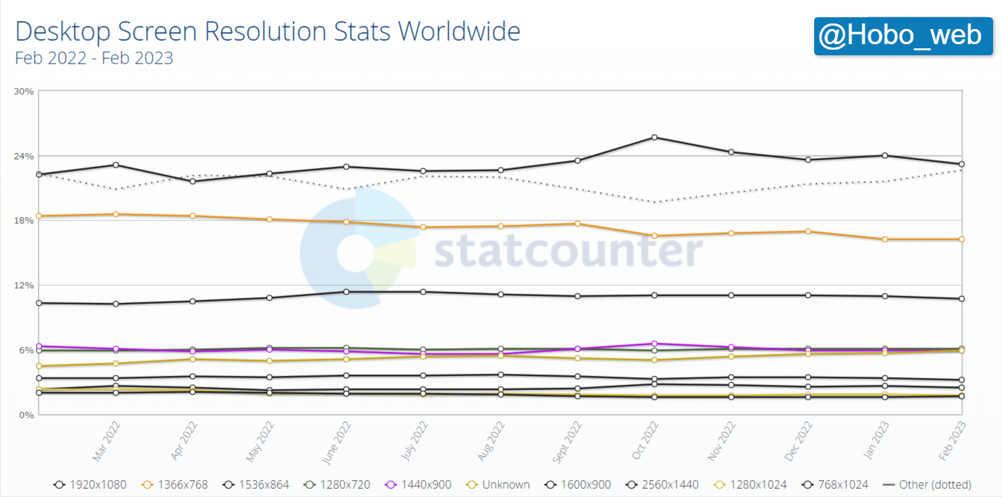
Most Common Desktop Screen Resolution Sizes Worldwide
- 1920×1080 – 23.22%
- 1366×768 – 16.28%
- 1536×864 – 10.76%
- 1280×720 – 6.07%
- 1440×900 – 5.93%
- 1600×900 – 3.22%
Tablet screen resolution stats worldwide Feb 2022 – Feb 2023
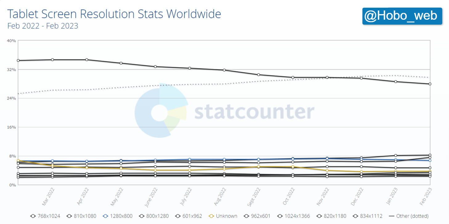
Most Common Tablet Screen Resolution Sizes Worldwide
- 768×1024 – 27.95%
- 810×1080 – 8.26%
- 800×1280 – 7.62%
- 1280×800 – 6.77%
- 601×962 – 4.66%
- 820×1180 – 3.42%
Desktop screen resolution stats in the US Feb 2022 – Feb 2023
Top screen resolutions in the US (2023)
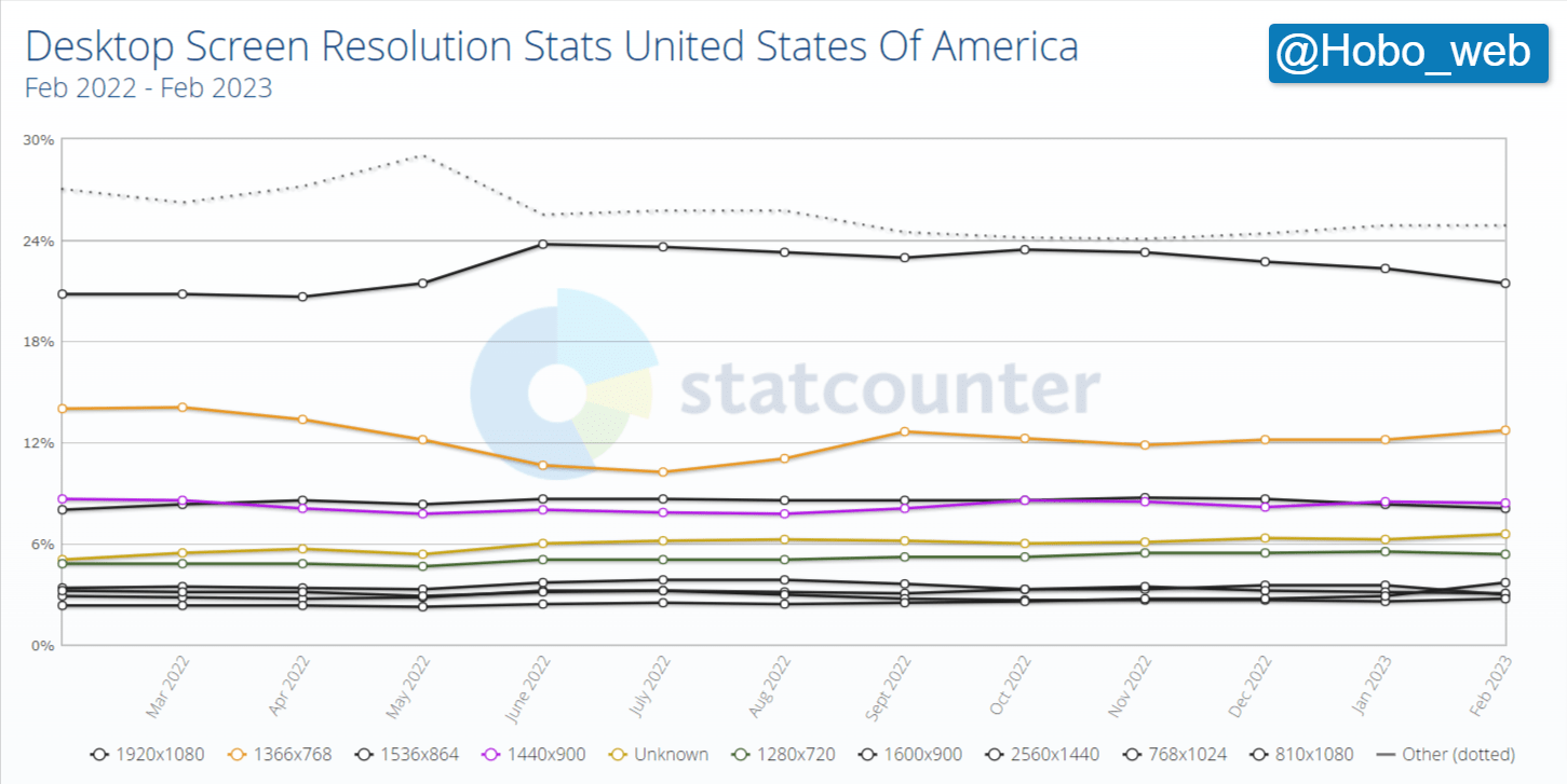
Most Common Desktop Screen Resolution Size in the United States Of America
- 1920×1080 – 21.44%
- 1366×768 – 12.76%
- 1440×900 – 8.43%
- 1536×864 – 8.09%
- 1280×720 – 5.4%
- 810×1080 – 3.69%
Mobile screen resolution stats in the US Feb 2022 – Feb 2023
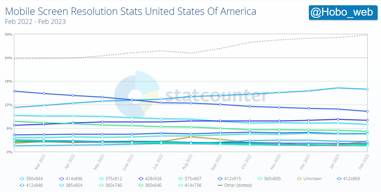
Most Common Mobile Screen Resolution Size in the United States Of America
- 390×844 – 13.16%
- 414×896 – 10.3%
- 428×926 – 8.02%
- 375×812 – 7.05%
- 375×667 – 5.26%
- 412×915 – 4.67%
Tablet screen resolution stats in the US Feb 2022 – Feb 2023
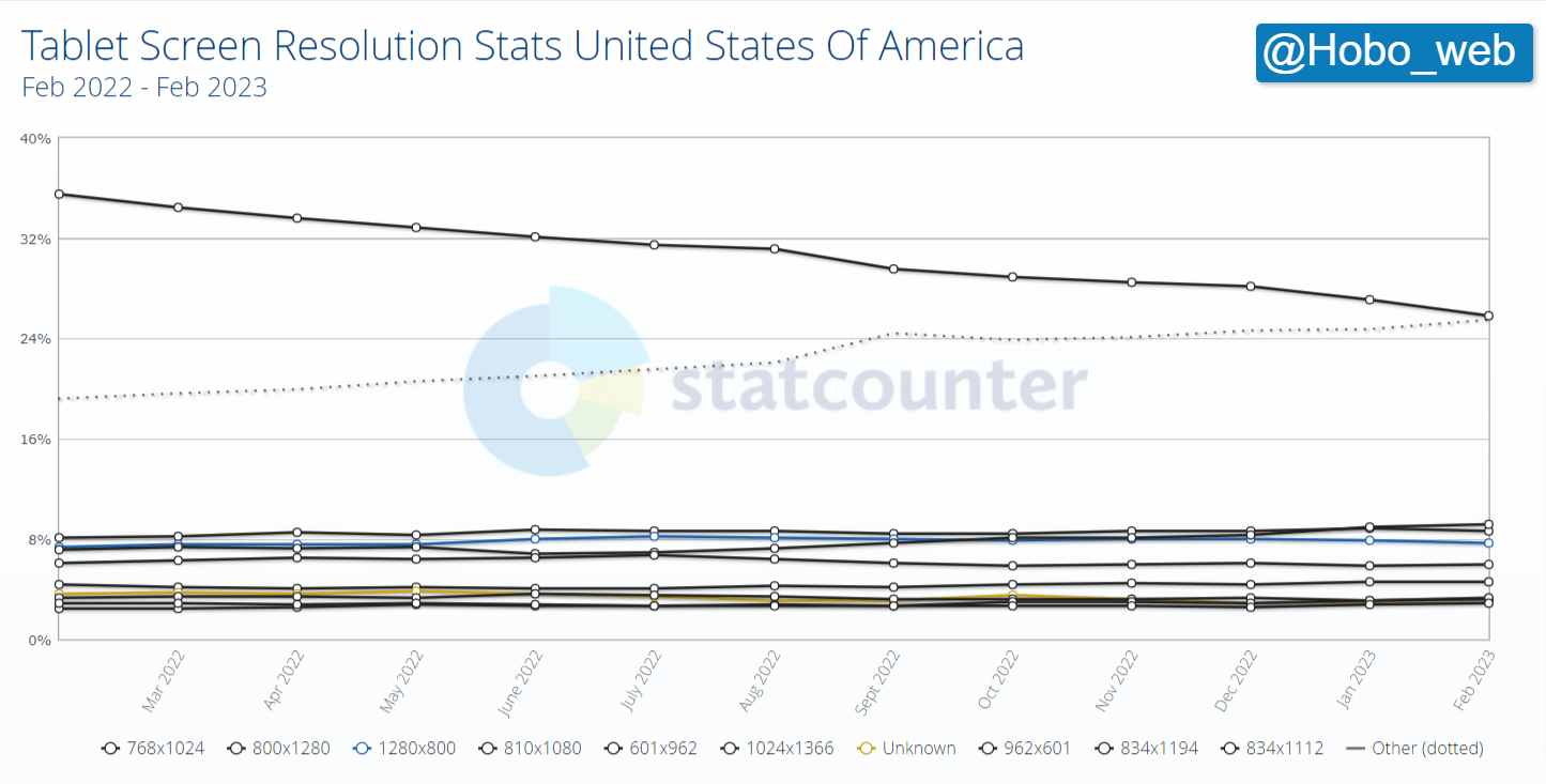
Most common Tablet Screen Resolution Size in the United States Of America
- 768×1024 – 25.83%
- 800×1280 – 8.63%
- 1280×800 – 7.73%
- 810×1080 – 9.21%
- 601×962 – 5.94%
- 1024×1366 – 4.61%
Desktop screen resolution stats in the UK Feb 2022 – Feb 2023
Top Screen Resolutions in the UK (2023)
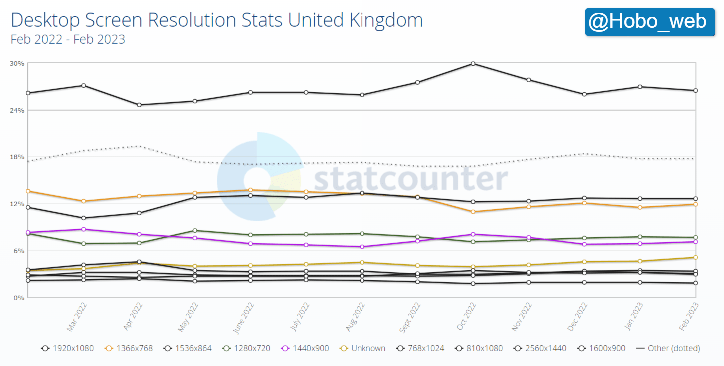
Most Common Desktop Screen Resolution Size in the United Kingdom
- 1920×1080 – 26.49%
- 1366×768 – 11.89%
- 1536×864 – 12.67%
- 1280×720 – 7.67%
- 1440×900 – 7.13%
- 810×1080 – 3.34%
Mobile screen resolution stats in the UK Feb 2022 – Feb 2023
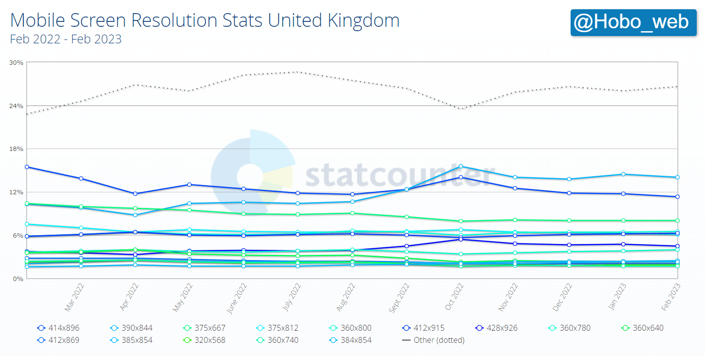
Most Common Mobile Screen Resolution Size in the United Kingdom
- 390×844 – 13.99%
- 414×896 – 11.33%
- 375×667 – 8.07%
- 360×800 – 6.53%
- 412×915 – 6.27%
- 375×812 – 6.11%
Tablet screen resolution stats in the UK Feb 2023 – Feb 2023
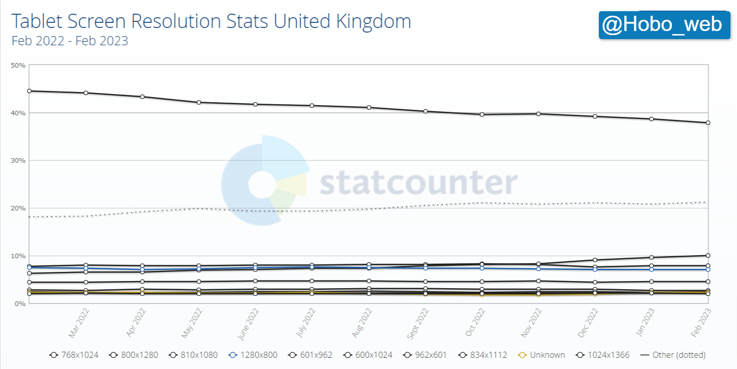
Most Common Tablet Screen Resolution Sizes in the United Kingdom
- 768×1024 – 37.93%
- 810×1080 – 10.01%
- 800×1280 – 7.82%
- 1280×800 – 7.11%
- 601×962 – 4.47%
- 600×1024 – 2.68%
Desktop vs mobile vs tablet market share worldwide Feb 2022 – Feb 2023
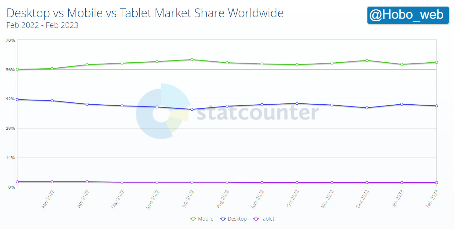
Desktop vs Mobile vs Tablet Market Share Worldwide
- Mobile – 59.36%
- Desktop – 38.6%
- Tablet – 2.04%
*Note – statistics above are from one (albeit credible) source, so will be skewed in unknown ways. Graphs supplied by http://statcounter.com/.
How to design a site that looks the same in every browser & resolution
You cannot design a site that looks the same in every browser & resolution.
It is impossible for you to design a website to look the same in every browser, platform, and screen resolution, so avoid trying.
You could opt for a fluid layout without tables for your design, with % widths that expand and contract to fit a visitor’s browser setting OR you could consider looking into responsive design solutions that will achieve much the same thing.
Google favours responsive designs, which is good news for those who have adopted it:
QUOTE: “Sites that make use of responsive web design and correctly implement dynamic serving (that include all of the desktop content and markup) generally don’t have to do anything.” Google NOV 2017
MOBILE IS ON THE RISE – so if developing a new website – you MUST think about how mobile-friendly your website really is from the start.
You should aim to keep things simple when coding websites.
You will not – cannot – please everybody – and the question of which website size is best is still a hot topic for debate by designers with usability and UX expertise.
It is of critical importance for you to identify YOUR audience and the devices they use, and build your website (on the whole) to suit THAT audience.
And that audience includes GOOGLEBOT.
Does your mobile site redirect to another URL & version of your site?
That’s not ideal. It has never been, in fact.
Way back in the day – some folk used TEXT-ONLY versions of a website to produce content for users/browsers that didn’t support elements of their websites – in a (usually vain) attempt to make their content more accessible.
The W3C even used to recommend it if all else failed:
QUOTE: “A text-only page, with equivalent information or functionality, shall be provided to make a web site comply with the provisions of this part, when compliance cannot be accomplished in any other way. The content of the text-only pages shall be updated whenever the primary page changes.” SECTION 508
It’s always been ideal to deliver one URL to a visitor for accessibility purposes, and there is no difference when delivering mobile or smartphone content if you are thinking about creating “a mobile” version of your site. This is even more important as Google is moving to mobile-first indexing.
Google has been confirmed to rate your website PRIMARILY on your mobile experience.
When Google is the ‘visitor’ it’s usually even more important to deliver just one URL because of canonical URL challenges for search engines – and this has been the case before the implementation of the canonical link element some time ago.
So the ideal situation is to deliver one URL at all times.
QUOTE: “If you have “smartphone” content…. you can use the rel=canonical to point to your desktop version…. When users visit that desktop version with a smartphone, you can redirect them to the mobile version. This works regardless of the URL structure, so you don’t need to use subdomains / subdirectories for smartphone-mobile sites. Even better however is to use the same URLs and to show the appropriate version of the content without a redirect John Mueller, Google
Ignoring Google’s recommendations is often not a smart move:
QUOTE: “crawling, indexing, and ranking systems typically look at the desktop version of a page’s content, which may cause issues for mobile searchers when that version is vastly different from the mobile version. Mobile-first indexing means that we’ll use the mobile version of the content for indexing and ranking, to better help…. primarily mobile – users find what they’re looking for. Webmasters will see significantly increased crawling by Smartphone Googlebot, and the snippets in the results, as well as the content on the Google cache pages, will be from the mobile version of the pages.” Google Nov 2017
Google offers the following tips to check your site is prepared for the mobile-first index, but essentially, if you are using a responsive web design template for your site you should have minimal issues with this change:
-
Make sure the mobile version of the site also has the important, high-quality content. This includes text, images (with alt-attributes), and videos – in the usual crawlable and indexable formats.
-
Structured data is important for indexing and search features that users love: it should be both on the mobile and desktop version of the site. Ensure URLs within the structured data are updated to the mobile version on the mobile pages.
-
Metadata should be present on both versions of the site. It provides hints about the content on a page for indexing and serving. For example, make sure that titles and meta descriptions are equivalent across both versions of all pages on the site.
-
No changes are necessary for interlinking with separate mobile URLs (m.-dot sites). For sites using separate mobile URLs, keep the existing link rel=canonical and link rel=alternate elements between these versions.
-
Check hreflang links on separate mobile URLs. When using link rel=hreflang elements for internationalization, link between mobile and desktop URLs separately. Your mobile URLs’ hreflang should point to the other language/region versions on other mobile URLs, and similarly link desktop with other desktop URLs using hreflang link elements there.
-
Ensure the servers hosting the site have enough capacity to handle potentially increased crawl rate. This doesn’t affect sites that use responsive web design and dynamic serving, only sites where the mobile version is on a separate host, such as m.example.com.
Your users expect to scroll down a page
As the first criterion implies, scrolling is always a key consideration. Users generally didn’t like to scroll if they do not need to – although, over the years, that’s changed.
So, when you design, you should consider how much users can see if they scroll only a screen full or two. Any more than five screens long could be an indication to you that there might be too much copy on the page. Of course, this is balanced with the view that some articles are meant to be in-depth information pieces and users would expect to wait a little longer to view some page content and content types.
Both scrolling and initial visibility obviously depend on screen size: Bigger screens show more content above the fold and require less scrolling.
Will a change to a responsive mobile site in better rankings?
Not necessarily, but maybe.
As many things to do with Google optimisation – having a mobile-friendly website is more or less to ensure you KEEP the traffic you are already getting, not necessarily give you any more free traffic from Google.
If you don’t already get a lot of traffic from mobile visitors – I’m not sure if this update from Google will have a noticeable effect on your traffic levels (in analytics at least) at the outset – but over time – it probably will be an extremely important challenge to navigate.
The quality bar is being raised – again – by Google, and its users – and if you want to compete in ever more competitive organic SERPs this is yet another hurdle for small businesses to get over.
In the LONG term – this mobile conversion can only be a good thing for your users – but in the short term – it will be interesting to see what effect it has on small businesses’ conversion rates – as conversion rates via mobile are often less than on desktop.
Google has said that this mobile-friendly algorithm will have a greater impact on SERPs than both Google Penguin and Google Panda algorithms – and we’ll find out more as time goes on.
How to check for important mobile usability issues on your site
Google Search Console
You should be able to track mobile errors in Google Search Console (AKA Google Webmaster Tools) and see errors disappear over time if your site is configured correctly.
Tool to test your site for mobile friendliness
- Search Console Url Inspection Tool
- Pagespeed Insights
- Think With Google
- Mobile Friendly Test
How to make your website mobile-friendly
Part 1 – PageSpeed Insights, Mobile-Friendly Test and Mobile-Usability
Part 2 – Viewports, zoom and plugins
Part 3 – Tap targets, margins and font sizes
Part 4 – Redirects
Web developers should find Hobo Web’s other recent post useful now that site speed is a ranking factor in Google:
QUOTE: “The mobile version of a website should ideally load in under 3 seconds and the faster the better. A VERY SLOW SITE can be a NEGATIVE Ranking factor (confirmed by Google). There is no set threshold or speed score to meet, just to make your page as fast as possible.” Shaun Anderson, Hobo 2021
I’ve audited thousands of websites over 20 years as a professional SEO. Here is what you need to know about SEO and a free tool to help you manage your projects or learn about SEO: https://t.co/WwZgEa8yBd A thread (1/10) pic.twitter.com/Abh5m3TOi4
— Shaun Anderson (@Hobo_Web) July 1, 2022
Mobile SEO Checklist
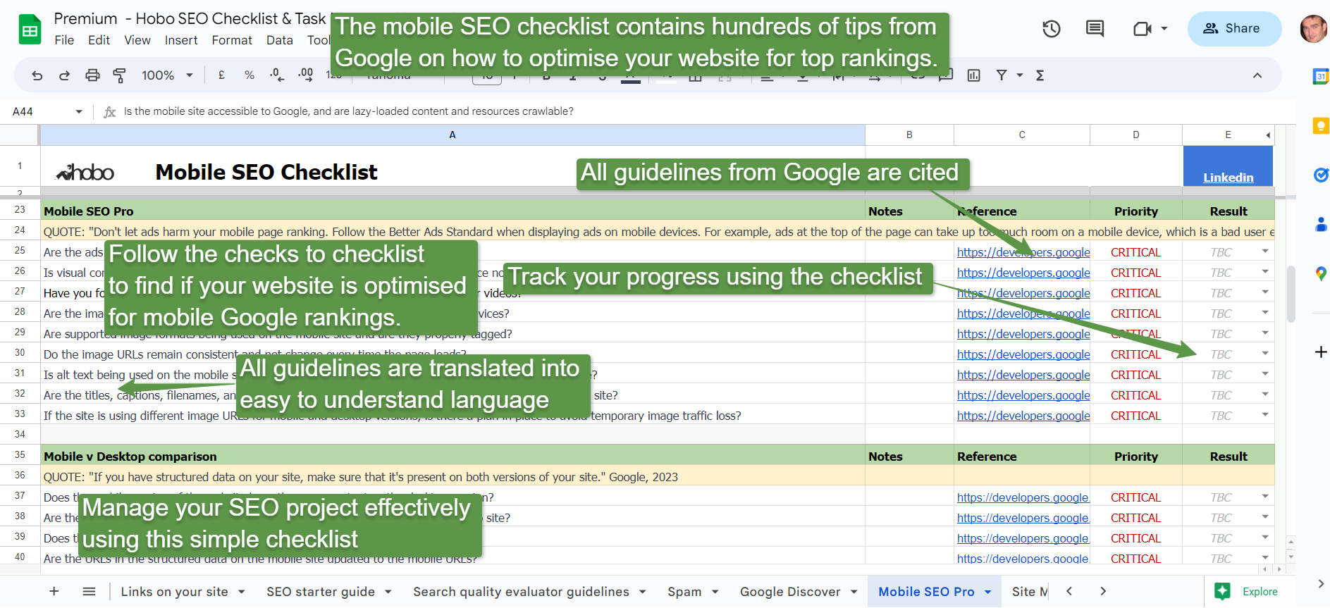
Your rankings are largely controlled by how your mobile site performs in Google search.
If you are interested in mobile SEO, the premium mobile SEO checklist (pictured) is for you.
Optimising for multiple screens FAQ
Why is optimising for multiple screens important?
Optimising for multiple screens is important to ensure that your website looks and performs well on various devices, including desktops, laptops, tablets, and mobile phones. It allows you to reach a wider audience and deliver a consistent user experience, regardless of the device your visitors are using.
What are some common challenges when optimising for multiple screens?
Common challenges when optimising for multiple screens include designing for different screen sizes, resolutions, and aspect ratios, adapting content to different devices, and ensuring that your website loads quickly on all devices. Other challenges include managing navigation, ensuring that forms and calls-to-action are easily accessible, and optimising for touch and mobile gestures.
How can I optimise my website for multiple screens?
Here are some tips for optimising your website for multiple screens:
- Create a responsive design that adapts to different screen sizes and devices.
- Optimise images and videos for faster loading on all devices.
- Use mobile-friendly navigation and design elements.
- Ensure that forms and calls-to-action are easily accessible and functional on all devices.
- Use touch and mobile gestures to enhance the user experience on mobile devices.
- Test your website on multiple devices and screen sizes to ensure consistent performance.
What are the benefits of optimising for multiple screens?
The benefits of optimising for multiple screens include increased reach and engagement, improved user experience, and higher search engine rankings. By providing a consistent and high-quality experience across all devices, you can build trust and credibility with your website audience and improve your chances of achieving your business aims.

